The following page outlines the key differences between the 4.x user interface and the 5.0 user interface redesign. These examples serve to demonstrate common changes and do not exhaustively list all screens or instances of change. Screenshots throughout the TeamConnect 5.0 documentation have been changed to reflect the new UI on all specific pages.
This page only lists enhancements new to the 5.0 platform. Updates between the 4.0 initial release and 5.0 are not listed, but these can be found in the respective pages under Enterprise Release Notes.
Note: The new user interface functions best with a browser width minimum of at least 1024x768. TeamConnect runs best on a 4:3 or 16:9 resolution.
User Interface Updates
Significant changes have been added to TeamConnect 5.0 to improve the user interface.
These UI changes include:
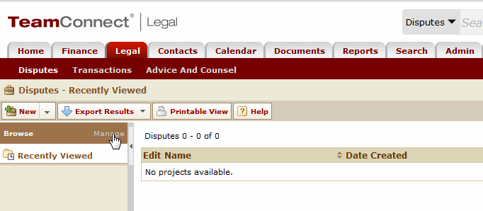
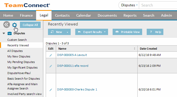
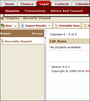
•The 'Back' link has been moved to the left side of the application.
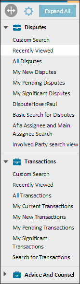
•The Manage link has been changed to a gear icon ![]() . This icon can be clicked on any object to see the collections for that respective object (e.g., search views and address books).
. This icon can be clicked on any object to see the collections for that respective object (e.g., search views and address books).
•Fonts have been changed to "Helvetica Neue" where available. Calibri is now the default font in the absence of Helvetica Neue.
•Colors have been updated for the system TC design; colors are also able to be customized (see Custom Color Profiles for more information). Any custom colors that exist prior to the 5.0 upgrade will be removed upon installation.
•Page Title has been moved.
•Text field styling has been updated to fit with UI overhaul as well as custom color profile design.
•Dropdown field styling has been updated to fit with UI overhaul.
•TeamConnect Themes have been descoped in favor of the Custom Color Profiles enhancement.
•Type ahead (or "incremental") search is now provided in the application.
Examples for 4.x Users
Click the description below to see side-by-side comparisons of how the new UI differs from 4.x versions.