
Elements can be added to the Screen Designer canvas. Elements are restricted to just UI elements that look like System Fields and Custom Fields, but are not based on the object type. They are work fields that you create and control. Usually several properties will require editing after adding an element to the canvas. Some properties, such as onChange, have text values that are intended to contain JavaScript.
•Anchor—A link to an internal or external address. Can contain the Message and Out elements.
•Batch Display—The main use case for Batch Displays is adding a table in which you can create, view, and update child or embedded objects. Additionally, it can pull tabular data connected by a one-to-many relationship with the associated object, for creating, viewing, and updating the tabular data.
•Block Template—A container to group any amount of fields in a custom block.
•Button—An interactive element that will trigger an event based on the Screen Designer user specification.
•Empty—Enters an empty <div> element to add spacing to the screen. This ensures that rows do not "collapse upward" to fill empty spaces in the layout as per default behavior.
•Message—Outputs a localized message given an i18n key. See Creating Custom Messages.
•Message Parameter—Inserts dynamic text into Messages. Message Parameters can only be placed in a Message element.
•New Record Link—Creates a new record of the specified object type.
•Out—Outputs a message in the block.
•Record Link—Links to a record of a specified object type.
•Row—Adds a row for housing fields to your screen. Fields require a row to be placed on the screen. Users can utilize rows to create disproportionate column widths and offset values applied to the entire block.
Advanced Elements
Advanced Elements allow additional functionality to TeamConnect fields. For example, if you need a relationship between one field and another field, you can connect them with Java Class files. However, you cannot create a new field from the Advanced Elements.
Note: Advanced Elements must be attached to a Java Class to function.
•Category—Displays a list of CategoryItemTreeItem objects returned from a Java class method. Displays the default category by default.
•Checkbox—A box that users can select or de-select to produce a Boolean value.
•Date & Time Field—A field for entering date and time information.
•Date Field—A field for entering date information.
•Lookup—A drop-down menu that lists the contents of a lookup table or a list method in a custom Java class.
•Memo Text—A text field that can hold more text than the Text Field Advanced Element. The limit for Memo Text fields is more than 200,000 characters.
•Multi-Value List—A multi-select box that lists the contents of a lookup table or a list method in a custom Java class.
•Number Field—A field that stores a numerical value.
•Radio Button—A list of radio buttons, wherein users can select only one radio button at a time.
•Select—A drop-down menu that allows the user to use a custom list force selection.
•Text Field—A text field that can hold up to 2,000 characters. The character limit of the input field can be defined in Screen Designer.
HTML Elements
HTML Elements allow you to insert HTML and JavaScript code directly into your custom block.
•Html—Allows the user to add HTML elements to the custom block.
•Script—Loads an embedded script onto the page.
JSP Elements
JSP Elements allow you to add logic to custom blocks utilizing a Java class. They require either a system Java class or custom Java class to work. System Java classes can be found in the Java docs.
•If Statement—Attaches a Boolean condition through a Java class. If that condition evaluates to true, then the contents of the tag are shown/loaded.
•If-Else Statement—Attaches a Boolean condition through a Java class, along with content to load when the condition is true and different content to load when the condition is false.
•For Each—Attaches to a List field in a Java class. Iterates through each item in that list, repeating some given content for each item (i.e. creating a label and a value for each item).
Reports
Reports are placed in the canvas in the same manner as elements. They can be used to display report output within a block. The Reports pane contains a hierarchical list of reports within folders. The report's properties will appear in the Properties pane after dragging a report into the canvas.
You can also drag a report folder into the canvas. In this case, only the report link is available in the block, not the report output. At runtime, when the link is clicked, that folder's contents (report names and subfolders) will appear in a Reports page.
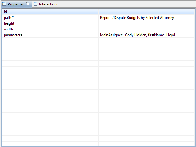
As of Screen Designer 5.2, parameters can be edited from the Properties pane on reports. The parameters property will list all parameters on the selected report as a comma delimited list. Users can adjust the value of these fields directly by typing within the property, e.g., "MainAssignee=Cody Holden". If the parameter is erased, users can retype the parameter name followed by an equals sign to restore the value (as demonstrated by the image below).
